Monday, April 02, 2012

Monday, March 19, 2012
Application Craft Impressions
 Application Craft (AC) is a very ambitious attempt to put modern HTML5 development, including mobile, onto the cloud.
The premise is this:
Sign up, sign on, start developing. All for free.
And you really can. It sports a WYSIWYG drag'n'drop form designer, a comprehensive smorgasbord of droppable widgets with property sheets, including layout containers and integrated jQuery Mobile UI components, and an embedded Javascript IDE within the browser. (It really reminds me of an online Visual Studio-like IDE for HTML5 and Javascript mobile apps.)
The big advantage of all this is that you can develop and deploy in your favorite HTML5 browser without the need for a web server to host on.
And what's more, they claim to support desktop, tablet and phone all from the same app, using in-built adaptive layout strategies.
The widgets can even be bound to a datasource, either inherent to the Application Craft framework, or linked to a SQL database on a different server.
Application Craft does have a monetizing model based on number of developer accounts, data storage and bandwidth.
New features are server-side javascript modules and file-based data sources.
My Take
One of the things that impressed me about this framework is that it has the potential to get prototypes and proof of concept apps up and running at virtually no cost.
I have a couple of pet projects I'm working on that are well suited to this. One is completely green-field and the other is a mobile version of an existing web site with its own database backend.
I found the online documentation quite comprehensive, if a little thin, and the many short video tutorials are very helpful to get you started, but are really just feature explanations with examples. A real step by step tutorial would be very helpful.
The online forums are worth using. The AC team is very responsive and will often offer to diagnose an app that you're having problems with if you're willing to share your password with them, or seem more than willing to do a Skype session with you to talk you through an issue. It's obvious they care about their product. However, I do wonder if it takes off, whether they will be able to keep this level of customer care up. For now, though, it's fresh air for early adopters.
It's clear that the AC team has covered their bases - there are ways to preview populated forms instantly in the IDE, run your app in Live mode on the desktop. There are plenty of hints and tips in the documentation on how to test out your app in desktop phone simulators and to set it up for debugging.
And because this is all hosted, if you happen to have an iPhone or iPad laying around, it's easy to test it out on the real thing.
AC also support wrapping with PhoneGap as a service if you really want your warez on the App Store or Google Play (the store formerly known as the Android Market).
All of this may seem too good to be true. Well, I can assure you it's all true, but it's an ambitious product, and there are definitely some rough edges. After playing with it for a couple of weeks, here's the good, the bad and the wish list:
The Good
- The Javascript IDE is almost as good as day-to-day coding in Eclipse. It has themes, a level of context sensitivity
- It's built on jQuery and jQuery Mobile, and so both of these libraries are available for your use if you know how to use them.
- The layout containers make it really easy to construct a well-behaved UI. Combined with the adaptive layout rules, you really can make a one size fits all UI, if you have the patience.
- An impressive set of UI widgets with the ability to add custom widgets of your own make or from third parties.
- Ability to create multiple apps within your console and have them up and running on your own application craft sub-domain in no time.
- Being a hosted end-to-end IDE, you can develop on one PC and pick up where you left using any other.
- A built in security model to ensure your developments stay private until you're ready to release them to the world.
- Many web developers are used to tweaking styles and CSS to adjust the look of their apps. AC all but alienates you from that. Not good.
- Application Craft's data storage is a good idea but really badly implemented. It's cumbersome and too complicated for anything but the very simplest of apps. I got the feeling that this was just an experiment that went wrong. Try to build out a data model using the AC system and you'll soon be tearing your hair out wondering where the productivity gain is. AC would do much better to recommend that users find a free database hosting service and link it up to the AC front end, instead of implying that they have a fully integrated solution.
- I'm still not really sure how customizable AC is, unless you're game to create custom widgets to fit into their framework. I get the impression that if you step outside the walled garden, you're going to wish you hadn't strayed.
- The AC API has quite a bit to be desired. It's quirky and overloaded, and has some annoying idiosyncrasies and inconsistencies. It could really do with a clean up by someone who has, well, developed an API intended to be used by other developers. It is a high level API and pretty powerful. However, when AC says you'll be programming in javascript, you'll really be programming in their version of event driven javascript, with a few lines of jQuery for the informed.
- True fixed headers and scrollable panels. The true fixed headers are promised with a near future integration with jQuery Mobile's updated widget set. The absence scrollable panels is more obvious when you upsize your app from phone-size to more complex pad-sized layouts.
- It would be nice to develop AC apps on iPad and iPhone devices on the go. Unfortunately the advanced AC IDE tools only seem to run inside modern desktop browsers.
I was able to get things done in AC, but not without several failed experiments and lots of property tweaking. Without a good understanding of HTML I'm not sure if I'd have made it without giving up. I'm not sure that it's really quite ready for prime-time just yet, but for getting a free hosted prototype hooked up to an online database it definitely has some merits.
Application Craft holds a lot of potential in its hands. I wish them good luck in reaching it as they round out and refine out the service.
Wednesday, March 07, 2012
Apple announces iPad 3, 1080p Apple TV, iOS 5.1
Apple is bring Siri to the Japanese in iPhone iOS 5.1
Apple TV is now 1080p interface and movies, with updated UI and photo streaming.
iPad 3 (not iPad HD as some had speculated):
Apple TV is now 1080p interface and movies, with updated UI and photo streaming.
iPad 3 (not iPad HD as some had speculated):
- Retina display is 2048x1536 pixels. Over 3 million pixels.
- Dual-core A5X chip & new Quad-core GPU (claimed 3x faster than NVidia Tegra 3)
- 5MP Camera full-HD 1080p video
- Voice recognition & dictation (not SIRI)
- LTE hi-speed digital wireless (Verizon and AT&T in US; Rogers, Telus & Bell in Canada)
- Same pricing as iPad2
Biggest surprize is that a full-blown SIRI experience is NOT part of the initial iPad 3 launch. It will probably turn up in a future update.
Neither is any space-age haptic feedback feature...
Rumours were flying, but it seems that April 1st came early this year!
Tuesday, March 06, 2012
iOS is king... of HTML5!

Backs up what I have observed. Android has similar hardware specs, but is lagging terribly behind in its browser implementation:
HTML5 Game Performance: iOS Performs 3x Faster Than Android
(Thanks to my work colleague for sharing.)
Some advantages of HTML5
I just posted this on the jQuery Mobile forum. My motive to inform people on there that it's not all about performance. (And the sole purpose of this is to concentrate on the advantages. Before you flame me for being one sided, I recognize there are disadvantages and that there are many reasons to NOT go HTML5.)
One of the primary drivers for adopting JQuery Mobile was flexibility in an uncertain world.
Todd, we realize there are many who are under the delusion that native simulation is achievable with HTML5, and I respect the reality check.
However, there is are other major advantages of HTML5 adoption - let's not get hung up on the pure 'performance is king' topic. Please bear the following in mind, and don't lose sight of the fact that users of HTML5 frameworks will EXPECT to host them in native wrappers. I'm glad that you cited that it is a secondary aim of jQM to support the Hybrid model of deployment.
1. Flexibility
1a. Adaptability
2. Consistent looks across platforms
3. True cross-platform "write once run anywhere" potential
4. Future proofing
5. Fast track adoption of new platforms
1. Flexibility
Building in HTML5 gives them the option to deploy as a web app, support HTML5 off-site installation (i.e. install to home screen) or use a native wrapper solution to get into the app stores. There may be many reasons that a solution builder may not already know their deployment strategy, not least because they are unsure that they will be pass compliance with an app store's ever changing policies.
(My personal situation is a case in point - we deploy our HTML5 app on Android as a Hybrid but were unable to reach agreement with the AppStore, and so deploy for iPhone on a web server with the option to install as an HTML5 application.)
1a. Adaptability
Another strong potential has been mentioned above. The potential to reach across formats with one adaptable solution is a very strong one, even if it is not front and center of people's minds at the present time. Frameworks like jQM have the potential to change the face of tradition site design by adopting and supporting a unified, adpatable interface across phones, tablets, netbooks, laptops and desktops. The advent of touch gestures and interfaces has revolutionized even the way people now expect to use their mouse.
2. Consistent look across platforms
Whereas the platform providers recommend certain style guidelines for apps built for their platform, some companies also have their own standards of usage and l&f. HTML5 apps can be styled to the unified standards of the company, not the platform provider.
3. True cross-platform "write once run anywhere" potential
By doing an HTML5 app, I am writing to a cross-platform standard. I have one code base, and have the potential to reach many platforms. My alternative? Invest in teams to develop the same app multiple times, or make a decision that only certain platforms are important to me, and shun the others.
4. Future proofing
So I have an HTML5 app. It doesn't work well on platform X. The trend towards HTML5 standard compliance means that someday it will work on that platform (and someday after that it may even work well!)
5. Fast-track adoption of new platforms
Getting my existing HTML5 app working on a new or future platform will be far less work than re-writing it in their proprietary native language. And if new providers are not on the HTML5 train, they might as well not be in the game.
I hope that the jQM team will realize that these are valid and achievable goals for HTML5 mobile developers, and decide not to leave anyone behind. We're passionate because we care!
Overthrow - an attempt to repair scrolling regions on mobiles
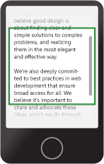
The guys over at the jQuery Mobile project recently made me aware of the Overthrow initiative at Filament Group (the main guys behind jQuery) to resolve the internal scrolling issues being experienced on so many mobile devices:
Here's the blog post, which links to the project page: Overthrow projectI'm looking forward to the slaying of this dragon!
Thursday, March 01, 2012
jQuery Mobile 1.1 fixed headers and footers
 In general, jQuery Mobile's fixed headers and footers are a nice solution. Mobile browsers are getting better at supporting it properly with no visual artifacts, but they're still not all the way there.
Here's the jQuery Mobile 1.1 RC1 test page to try out your mobile devices:
(Note that jQuery Mobile has disabled page zooming on pages with fixed headers and footers to suppress some crazy behaviour!)
Their solution is based on this suite of test pages by Brad Frost: http://bradfrostweb.com/demo/fixed/index.html
You can comment below if you find anything weird.
To my surprise, three Android 2.3 devices do very well, (Hallelujah!) and our iOS5 device supports it very nicely - well, that is until you allow the user to pinch-to-zoom the browser page content! (Controlled by an HTML header page directive.) Then some very weird things start to happen. On Android 2.3 it seems to forget that it knows how to do fixed positioning, and on iOS5 it's even more entertaining: the fixed header will move at a different rate to the page content, and when you hit the right extent of the page, the header actually moves in the opposite direction to the page text! Who knew the iPhone supported parallax scrolling effects!!!
And here's the really bad news, if you're still on iOS 4 (or earlier). Since this platform doesn't support fixed positioning well, the jQuery team decided to 'degrade gracefully'. Unfortunately they put the emphasis more on degrade than gracefully, and now iOS 4 doesn't support any type of fixed header and footer at all without putting the onus on the developer. The previous solution was to have the header and footer fade out during the page scrolling (since it would move with the page content during the scroll) and then fade back in when the scrolling was done (since the browser would correct the position of the fixed position elements once the user lifted their finger).
I pointed out to the jQuery Mobile team that their new degradation strategy was biased toward web pages and not web apps, since now iOS 4 users could not have toolbars at the bottom of the screen, only at the bottom of their content. What a bad user experience that is! It's now virtually impossible to position a navbar at the bottom of the screen, which to me defeats the object entirely.
It appears that they see my point and we will at least have a way of falling back to the 'old way' soon, even if it is through a plugin or extension library.
I actually think there's an even better option for iOS 4, and that's using a javascript scroller div like the iScroll component. We already use a scroller in our mobile app and it works just fine on iPhone, (with the exception of textarea controls which grab the swipe event overriding the scroller). It was Android that was the problem. (See previous posts.)
Tuesday, February 28, 2012
jQuery Mobile RC1.1

At last! jQuery Mobile has released a candidate for the much anticipated version 1.1 with the 'Fixed headers and Footers' fix we've been waiting for.
As discussed previously, there was no good option for Android. The third party js widgets were slow to respond, jittery and buggy.
But now we can have fixed CSS headers & footers using native page scrolling. (If you want to know why it was such an issue, see this blog and vlog by Brad Frost.)
I'm going to test it out and report my findings. Stay tuned...
Monday, February 13, 2012
Sencha report on Mobile Chrome
Sencha Labs does a good job of putting HTML5 browsers through their paces.
As I was, they're quite well impressed with Mobile Chrome, but have already found some things lacking. This quote just about sums up my feelings on the subject of compliance versus real-world performance:
"As we’ve said many times previously, many mobile browsers do well on the checkbox tests like Modernizr, but fall short when it comes to real world applications and content. (In some cases, mobile browsers have even reported support when none exists.) So for real world testing, we use a collection of our own favorite HTML5 sites and demos.
First up, the new CSS properties for mobile content. On our HTML5 wish list for 2011 we asked for high performance position: fixed. And Chrome for Android delivers. For simple pages, Chrome for Android does a top notch job of glueing fixed position content to the screen. Fixed headers and footers for simple mobile optimized pages are now easily implemented without having to use a framework. However, the browser struggled when trying to maintain fixed positioning on more complex pages, particularly when combined with pinch/zoom. We saw poor frame rates and occasionally content disappeared or was misplaced. Happily, the very new
-webkit-overflow-scrolling: touch property, which debuted in iOS 5, is also now available in Chrome for Android. It’s smooth and fast. (Nice job Chrome team!)"See the full report here:
Wednesday, February 08, 2012
1st Impressions: Google Chrome Beta on Android ICS
 Turns out I was right: Google have been working on Mobile Chrome. (I assume it will eventually replace the deficient default Android browser.)
As a x-platform HTML5 webapp developer, I have been burned BADLY by the default Android Browser. It sucked in four main ways:
- internal scrolling widgets (like iScroll)
- form rendering
- non-GPU accelerated 2D transforms
- inconsistent implementation from different OEMs.
The ICS default browser was a slight improvement in forms, but still full of rendering glitches and obviously not utilizing GPU acceleration for ops like scrolling and map panning.
First impressions on Android Chrome: Logistically we should see almost no fragmentation through Chrome than we do through the mangled browser implementations we are getting from the OEMs. (However, it remains to be seen whether some phones (typically HTC) will still omit to implement multi-touch in the browser from ICS forward, but it's a real problem for advanced web apps today.) Form rendering is better, rendering glitches are reduced, but performance is still on par with the ICS default browser. What gives? Chrome claims to implement hardware accelerated rendering? Compare Google or Bing maps on the web with the native implementation and you'll notice obvious lag. Then browse to the same URL with iOS Safari and you'll see how it should be done.
C'Mon Google - We expect better than this. You're LAGGING behind. (Pun intended.)
The ICS default browser was a slight improvement in forms, but still full of rendering glitches and obviously not utilizing GPU acceleration for ops like scrolling and map panning.
First impressions on Android Chrome: Logistically we should see almost no fragmentation through Chrome than we do through the mangled browser implementations we are getting from the OEMs. (However, it remains to be seen whether some phones (typically HTC) will still omit to implement multi-touch in the browser from ICS forward, but it's a real problem for advanced web apps today.) Form rendering is better, rendering glitches are reduced, but performance is still on par with the ICS default browser. What gives? Chrome claims to implement hardware accelerated rendering? Compare Google or Bing maps on the web with the native implementation and you'll notice obvious lag. Then browse to the same URL with iOS Safari and you'll see how it should be done.
C'Mon Google - We expect better than this. You're LAGGING behind. (Pun intended.)
Monday, December 19, 2011
No Festive Goodwill from Apple
You are chatting with Alicia, an Apple Expert
Hi, my name is Alicia. Welcome to Apple!
You: Hi - I am considering a MacBook Pro.
Alicia: Hi!
Alicia: Ok
Alicia: How can I help?
You: Wondering if there are any plans for a Boxing Day Sale price in Canada?
Alicia: We do not have sales for Boxing Day in Canada. I'm sorry.
You: Oh! Boxing Day is my birthday! Can you offer me any special deals?
You: :)
Alicia: If I had any promo codes, i sure would!
Alicia: But I don't.
Alicia: I'm sorry!
You: Where might I get a special promo code from?
Alicia: We don't have them right now.
Alicia: That space is for when we have any (like shipping codes).
You: When do you have them? When is the best time to buy a Mac?
Alicia: It is very rare that we ever have them.
You: I bet you have them on Black Friday? Why not on Boxing Day for Canadians?
Alicia: This chat service is here to help with the Apple Online Store. How may I help with your shopping?
You: I have the items in my cart and I'm having trouble hitting the buy button...
Alicia: Ok. What seems to be the issue then?
You: It costs too much. A little seasonal goodwill from Apple would help.
Alicia: I'm sorry. If I had any promo codes to offer, I would offer them to you. Apple is known to be a company with little to no sales.
You: Well you may have just lost a customer. I think I'll buy an ASUS for $1000 less.
Alicia: That's fine. keep in mind, their quality is not the same as ours. It won't last you half as long either.
Alicia: If that's what you choose.
You: I don't think that you can qualify that statement. A friend of mine (loyal Apple customer) told me to buy the AppleCare warranty because he has ALWAYS needed it.
Alicia: Well, his situation might be different. I'm not going to argue with you.
Alicia: I don't have any discounts or promo codes to offer you.
Alicia: Is there anything else today?
You: I didn't come here to bash Apple. I want to buy one but I'm not getting a warm and fuzzy that would make me a happy customer. I will have to think about it some more... Thank you for your time.
Alicia: Well you are asking me to give you something that I simply do not have. If I did, I totally would. But you thinking that I do and just won't give it to you.
You: If you threw in a free 1 year One-to-One membership or something like that, I think I would buy it today. All I want is a little good will or flexibility.
You: But it sounds like your hands are tied.
Alicia: My hands are tied. I have absolutely nothing I can "throw in" or any promo codes I can even offer. If I did, it would be no problem giving it to you!
You: OK. Bye Apple.
Alicia: Thank you for visiting the Apple Store. We appreciate your business. If you would like more help, please chat with us again.
Thank you for choosing the Apple Store. If you have any additional questions, please chat us again.
Hi, my name is Alicia. Welcome to Apple!
You: Hi - I am considering a MacBook Pro.
Alicia: Hi!
Alicia: Ok
Alicia: How can I help?
You: Wondering if there are any plans for a Boxing Day Sale price in Canada?
Alicia: We do not have sales for Boxing Day in Canada. I'm sorry.
You: Oh! Boxing Day is my birthday! Can you offer me any special deals?
You: :)
Alicia: If I had any promo codes, i sure would!
Alicia: But I don't.
Alicia: I'm sorry!
You: Where might I get a special promo code from?
Alicia: We don't have them right now.
Alicia: That space is for when we have any (like shipping codes).
You: When do you have them? When is the best time to buy a Mac?
Alicia: It is very rare that we ever have them.
You: I bet you have them on Black Friday? Why not on Boxing Day for Canadians?
Alicia: This chat service is here to help with the Apple Online Store. How may I help with your shopping?
You: I have the items in my cart and I'm having trouble hitting the buy button...
Alicia: Ok. What seems to be the issue then?
You: It costs too much. A little seasonal goodwill from Apple would help.
Alicia: I'm sorry. If I had any promo codes to offer, I would offer them to you. Apple is known to be a company with little to no sales.
You: Well you may have just lost a customer. I think I'll buy an ASUS for $1000 less.
Alicia: That's fine. keep in mind, their quality is not the same as ours. It won't last you half as long either.
Alicia: If that's what you choose.
You: I don't think that you can qualify that statement. A friend of mine (loyal Apple customer) told me to buy the AppleCare warranty because he has ALWAYS needed it.
Alicia: Well, his situation might be different. I'm not going to argue with you.
Alicia: I don't have any discounts or promo codes to offer you.
Alicia: Is there anything else today?
You: I didn't come here to bash Apple. I want to buy one but I'm not getting a warm and fuzzy that would make me a happy customer. I will have to think about it some more... Thank you for your time.
Alicia: Well you are asking me to give you something that I simply do not have. If I did, I totally would. But you thinking that I do and just won't give it to you.
You: If you threw in a free 1 year One-to-One membership or something like that, I think I would buy it today. All I want is a little good will or flexibility.
You: But it sounds like your hands are tied.
Alicia: My hands are tied. I have absolutely nothing I can "throw in" or any promo codes I can even offer. If I did, it would be no problem giving it to you!
You: OK. Bye Apple.
Alicia: Thank you for visiting the Apple Store. We appreciate your business. If you would like more help, please chat with us again.
Thank you for choosing the Apple Store. If you have any additional questions, please chat us again.
Wednesday, November 23, 2011
Layout strategies for iPhone & Android, Portrait & Landscape, Web App and installed App
Tactile Mobile apps are where it's at - they've revolutionized the user experience to become so intuitive that even babies claw at their parent's phones to make the pretty lights move with their fingers.
We are no longer talking about clicking, double-clicking and dragging, but about tapping, holding, pinching and swiping.
With this revolution come certain expectations. I now expect an immediate response to my gestures and to have the phone sense when I turn it and adjust accordingly.
This post is about how to meet the user's expectations around resizing when developing HTML5 in the mobile browser.
"But isn't that the browser's job to layout my app properly no matter which way the phone is turned?" I hear you ask.
No. Unless your web app is really just a web page with no special layout restrictions, you are mistaken to think that the browser will do this for you with no effort on your part.
First of all, play with your phone's browser a little to understand what it does with a regular web page. Don't get caught in that 'false security zone' which makes your brain think that it's so intuitive that it always knows what it's doing. After a few minutes you'll probably be surprized at what you thought you knew.
One common scenario is that the browser zooms out to a predetermined width by default, making the page elements look very small and sometimes illegible. This is great when you're browsing the web, but not what you want when displaying a web app UI. So the first thing you should know is that there are special HTML5 mobile directives which tell the mobile browser how to present your web page.
I won't go into that here, there are plenty of references on the internet, like this one:
http://learnthemobileweb.com/2009/07/mobile-meta-tags/
However, I will tell you that what you probably want is this configuration:
<meta name="MobileOptimized" content="width" ><meta name="HandheldFriendly" content="true"><meta name="viewport" content="width=device-width, user-scalable=no, initial-scale=1.0, maximum-scale=1.0, minimum-scale=1.0">
This will encourage the phone to size your page to the width of the device, disable the ability to pinch-zoom the page content, and prevent the browser from scaling your content when rotating the phone.
But what about more complex layouts?
A common goal for mobiles apps is the iPod interface layout on the iPhone: A header bar along the top with back and forward buttons either side of the title, a toolbar with icons along the bottom and a scrollable area in the middle showing a list of things (Artists/Tracks/Genres, etc).

One of the fundamental differences with browsers compared to application layouts is that fixed height layouts are hard to implement. The idea being that if you constrain the width the content must be shown and should therefore flow down. Doing fixed height layouts on browsers has often been a challenge. On mobile, the challenge has been further complicated by the fact that internal scroll areas have encountered problems. (iPhone has only in iOS 5 started supporting scrollable divs.) Widgets like iScroll have emerged to try to give web apps the ability to mimic native layouts. However, as I have discussed in previous posts, Android has some serious issues in this area.
However, let's suppose that in an ideal world (i.e. on an iPhone) the center panel scrolls smoothly. What hurdles do we have to leap to support device rotation in the browser?
In essence, assuming the top toolbar stays in place, there are two main things to do: size the central scroll view and position the navbar at the bottom.
This turned out to be a lot harder to implement on Android than on the iPhone.
I came up with a strategy to determine the available screen dimensions and divide up the UI into its proportional parts: status bar, toolbar, content area and navbar. I could then determine the dimensions for each based on the device type and orientation.
Cross-platform (in)compatibility
Things were pretty straight-forward on the iPhone. My strategy seemed sound. The browser did what it was supposed to do and soon I was rotating the device and seeing the layout adjust accordingly. The theory was that this would 'just work' on Android. How wrong I was.
The two main things that made this difficult on Android were:
I soon discovered that the Android browser did not report the physical screen dimensions correctly.
Using jQuery Mobile, Android was also challenged in reporting what mode it was in: landscape or portrait. In fact, much of the time it was opposite to what was reported on iPhone! I discovered that the orientation change was fired from the resize event, and so ended up just working it out from the browser's resize event instead.
To resolve the first issue on Android, I used the bottom css property to compensate for the fact that it could not tell me the dimensions of its own screen. Fortunately this worked, or I would have been really stumped. Ironically, the same approach didn't work on iOS, so I needed to handle each platform differently.
A further issue with the Android resize event is that it gets triggered when the keyboard is up, and reports the new dimensions of the area displayed above the keyboard. And on certain devices, the available height is now less than the available width, which makes the code think it's in landscape mode! What's more, the navbar is repositioned just above the keyboard, since that is now, temporarily the bottom of the webpage... Grief like this makes you wonder if it's worth it!
iOS Standalone Mode
On iPhone, you can save a web app to the Home screen. You will want to tell the iPhone that your app supports this mode using this directive in your HTML page's head section:
<meta name="apple-mobile-web-app-capable" content="yes"/>
You can even define a custom home page icon and loading image:
<link rel="apple-touch-icon-precomposed" sizes="114x114" href="images/icon-114.png" /><link rel="apple-touch-icon-precomposed" href="images/icon-57.png" /><link rel="apple-touch-startup-image" media="mobile" href="images/fl_startup.png" />
This is awesome for mobile web developers who don't need the App Store. This mode gives a less cluttered interface to the user, and makes the app feel more like a native app than a webapp. The address bar no longer is accessible, and the web browser's toolbar is gone. :)
In javascript, Apple provides a special flag to determine the mode you're in:
window.navigator.standalone
You can use this to help when laying out code to determine whether the web toolbar is taking up space.
Supporting high resolution displays
Here's an example of how to use a high resolution image on wide or high pixel density devices:
@media only screen and (-webkit-min-device-pixel-ratio: 1.5),only screen and (min-resolution: 240dpi) {.ui-icon-spinner {background-image: url(../images/spinner@2x.gif);}.ui-icon-spinner {-webkit-background-size: 16px 16px;background-size: 16px 16px;}}
CSS Only Solutions
This is a bit beyond the scope of this article, but there's a school of thought that CSS3 media queries can be used to cater for 90% of the situations without 'resorting' to code. The irony is that the media queries themselves are quite 'code-like' in their formulation, and so it's really just a case of picking your poison.
However, the possibility exists to do some great things with layout on different sized devices using CSS3 queries. A classic example is to define a layout which stacks layout blocks vertically for small devices, but horizontally for larger devices like tablets and desktop browsers. One can even hide certain elements when available screen space is at a premium.
Wednesday, November 16, 2011
I am Android - for we are many...
A picture of health? In this case green is healthy and iPhone is in excellent health compared to Android which is red and burning hot with a fever.
I think this pretty much sums up my statement in the last post that Android is not a platform but really a minefield of similar but significantly different devices derived from a common base.
This is based on research published in a blog post by Michael Degusta.
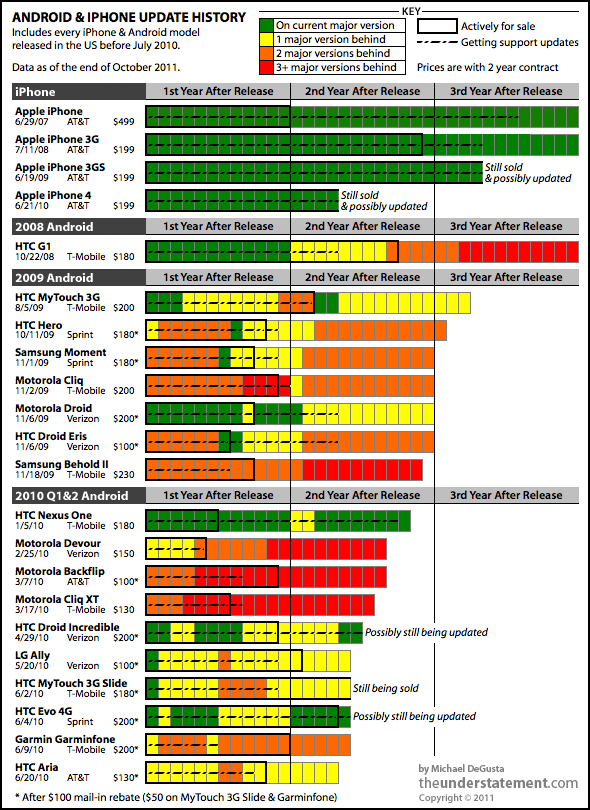
This picture is like a burning fire which should have the effect of warning developers to stay away!
And the best supported phone on this chart is the HTC Nexus One. But it's the end of the line for the Nexus - "it's just 'too old' for the new software". (Link to news article.)
(Thanks to Wazoo for pointing this out to me - and for quoting my blog!)
Tuesday, November 15, 2011
This is not the Droid we are looking for!
My previous post indicated that I had frustrations with Android.
Back to Android. Android is assumed to be a direct competitor to the iPhone and somewhat on par with it. At least it's marketed that way, and I would say perceived that way, by many.
I will tell you why.
But first of all let me congratulate Steve Jobs & co for raising our expectations so high! The iPhone really is a product that deserves its place in the history books of technological advancement. It really does deliver exceptionally well on all fronts - including its excellent embedded browser. It is a shining example of standards support and best-in-class implementation. Steve Jobs had a theory that user experience should drive your business. With the iPhone he realized his vision and exceeded my expectations.
Back to Android. Android is assumed to be a direct competitor to the iPhone and somewhat on par with it. At least it's marketed that way, and I would say perceived that way, by many.
The reality is a very different story. The difference is that where iPhone controls the hardware of their platform and is therefore working from a common hardware base, Android is an open architecture. The Android software is available for all the wannabe hardware manufacturers to base their software build on. Each manufacturer puts a different hardware configuration together and tweaks the basic software to work with their hardware. For competitive advantage, some manufacturers will also tweak the browser software and other components to their own whim. So when a phone says it is Android 2.2, it will not necessarily work the same as another 2.2 phone. There will be differences. Not all 'droids are created equal.
To compound the problem, the carriers will also want specifics for their own purposes. For example, custom apps bundled in to the base build to be pre-installed on the phone.
Furthermore, where it falls apart is in the software landscape. How do you get a software update for your phone? From the provider. Who releases the build? The manufacturer through the provider. So now the manufacturer is a software development house. They have branched the code for all their devices, and are stuck with supporting them. They not only have specific builds for each of their hardware configurations, but also have to customize that build to satisfy the demands of the network providers. And it's not in their best interests to be caught in a support cycle. There's no revenue in that - the phone has already been sold. They are interested in getting the next product out the door before their competitors do. And as we've seen, getting updates for Android has proven extremely frustrating for end users. Think of all the effort required to put the next great Android release from Google onto an already released phone. Chances are that the effort will be put into the next phone to be bought, not the one that has already been sold.
So how does all this affect the developer?
Well, to deliver on Android we have to contend with many, many different devices, many of which have different software configurations and patches on them. And this assumes that there are no hardware glitches or known issues - a very naive assumption when you realize that most of these products have been rushed into a highly competitive market.
Steve Jobs actually addressed this situation in what is called his 'Google rant'. I just think he was trying to expose the truth and help Google to see that they were going down a path that would induce pain on all fronts. You could see this as an arrogant 'told you so' rant, but I see it as a fair warning and glad you told us.
So taking all this into consideration, as a software architect you might look for ways to alleviate the pain. No development shop wants to manage any more code branches than they have to.
As an architect, you would not be at all blamed for following this line of thought: Android is not really a standard, but a myriad of very similar, but significantly different products. I need a common platform to deliver on. Is there an alternative?
Hang on, isn't that excellent HTML5 compliant iPhone browser based on webkit? Yeah - it's actually called Mobile Safari. Isn't Google Chrome based on webkit too? That browser on the Android phone is also webkit-based and HTML5 compliant. It must be Mobile Chrome. Why don't we build our apps to web standards instead? I've heard you can do some really nifty animation effects with CSS3... this could be just what I'm looking for, and it actually might be a lot of fun!
STOP RIGHT THERE!
Time for a reality check (or two)! (Remember that I'm biased towards creating cross-platform HTML5 mobile apps, so I'll talk a lot about the browser.)
- Reality check #1: The current Android browser is not Mobile Chrome. Remember - Google bought Android, they didn't make it. It may pass the HTML5 compliance tests, but that does not mean to say it does it well. My experience with the Android browser is that it's glitchy, inconsistent across devices and rough around the edges. For example, its rendering of CSS3 rounded corners is noticeably jaggy, and positioning of elements is often off by a pixel creating gaps where there should be none. (My suspicion is that Google are frantically re-implementing the Android browser to become the Mobile Chrome many think it is.)
- Reality check #2: All Androids (and their browsers) are NOT created equal. Manufacturers tweak the browser code too for their own purposes.
- Reality check #3: There are also certain commercial, political and legal reasons why things are different on different Android devices. Don't believe me? Load up Google maps in the Android browser and try doing pinch to zoom on a 2.x HTC phone. Now try the same on a Samsung phone. The difference? HTC does not want to impinge on multi-touch patents, hence no pinch to zoom in the browser. (Samsung supports pinch-to-zoom. But they had to withdraw some devices in some countries because of patent infringement. Could there be a link?)
- Reality check #4: Just because it's got it, doesn't mean to say it flaunts it. Android devices have some of the most impressive hardware specs around. Multi-core processors, GPUs & gobs of memory. However, try panning Bing Map in the Android browser. Then try it on an iPhone. The difference: Android does not implement hardware acceleration in the browser rendering of elements, and it shows.
- Reality check #5: Even though it's in the best interests of Google to improve Android fast (to live up to the expectations of its customers and become a truly viable competitor), this does nothing to rectify the myriad of broken/deficient devices that are already out there. And even when they do fix the Android reference build, how will they enforce standards on an 'open' community who will continue to tweak the core to meet their own agendas?
In short, if you were expecting Android to be a platform you could deliver on, be ready for a reality check. You might have been looking to extend your application to other devices, and assumed that Android was a platform just like iOS. However: "This is not the Droid we were looking for!"
Welcome to the minefield that is Android. To mis-quote a biblical verse: "I am Android, for we are many."
Tuesday, September 27, 2011
The Reality of Mobile Web Development
I'm just coming out of the other end of our mobile web project. What an interesting, and sometimes frustrating ride!
As I have time, I'll go into details in other posts, including:
Here are some conclusions:
- jQuery Mobile is now at release candidate 2
- iPhone rocks on the mobile web
- Android browser is deficient
- Blackberry is seriously deficient - don't go there - it'll be stone dead in a moment!
- Windows Mobile - Late out of the gate, initial signs are good, but it's too early to tell
If the promise of cross-platform mobile web applications is going to be fulfilled, standards need to be conformed to, and implementation of those standards must be done well. Android should really be a contender, but they need to get their act together.
The theory of cross platform mobile web development seems sound: both iPhone and Android phones are smart devices with large memory footprints and state of the art processing power. Both have WebKit-based HTML5 compliant browsers. However in the real world they are worlds apart. You see the devil is in the details. In the final analysis, iPhone is a platform and Android is a minefield of different software and hardware configurations based on a core reference implementation. Android is not a platform, so much as a legion of platforms built out of similar materials.
It's PC vs Mac all over again in the mobile space.
The theory of cross platform mobile web development seems sound: both iPhone and Android phones are smart devices with large memory footprints and state of the art processing power. Both have WebKit-based HTML5 compliant browsers. However in the real world they are worlds apart. You see the devil is in the details. In the final analysis, iPhone is a platform and Android is a minefield of different software and hardware configurations based on a core reference implementation. Android is not a platform, so much as a legion of platforms built out of similar materials.
It's PC vs Mac all over again in the mobile space.
As I have time, I'll go into details in other posts, including:
- This is not the Droid we were looking for!
- Layout strategies for iPhone & Android, Portrait & Landscape, Web App and installed App
- Delivering flexibility - versatile deployment strategies
- Optimization & caching techniques
- Integration with Facebook
Wednesday, March 16, 2011
Native vs Hybrid
I read an interesting post reporting on a debate between developing mobile Web Apps vs going Native. This has been a hot topic at work lately, and I'm a big advocate of doing what fits best. I like to keep my options open, and not be forced into a corner. So in many instances, I come down on the side of cross-platform HTML5 WebKit apps.
Whereas some applications are definitely best implemented as native, (arcade style games come to mind as obvious), many business & productivity applications are content driven, and must be connected. Sure we need a slick user experience - and Apple devices have certainly raised the bar in this respect. But in many cases the emphasis from a development point of view should be on cross-platform capability, not device-specific slickness. The quandry is, that this is not really in the best interests of the device manufacturer who has so much more to make than the price of the device if they can just lock you in to their platform.
That said, you can have the best of both worlds with tools & frameworks like WebKit, jQuery Mobile and PhoneGap. WebKit transitions are as good as native, jQuery Mobile promises to give a consistent & performant cross-platform experience (just give it a few more months) and PhoneGap gives you the choice to wrap it all up in a native shell and enhance only the parts of a WebApp that need to be native without having to go completely down the one-way dead-end street of single platform implementation.
Objective-C and Cocoa Touch taught us a lot about how to do mobile right, but now it's time to leave the Apple University and realize that the real world does not revolve solely around Apple.
Whereas some applications are definitely best implemented as native, (arcade style games come to mind as obvious), many business & productivity applications are content driven, and must be connected. Sure we need a slick user experience - and Apple devices have certainly raised the bar in this respect. But in many cases the emphasis from a development point of view should be on cross-platform capability, not device-specific slickness. The quandry is, that this is not really in the best interests of the device manufacturer who has so much more to make than the price of the device if they can just lock you in to their platform.
That said, you can have the best of both worlds with tools & frameworks like WebKit, jQuery Mobile and PhoneGap. WebKit transitions are as good as native, jQuery Mobile promises to give a consistent & performant cross-platform experience (just give it a few more months) and PhoneGap gives you the choice to wrap it all up in a native shell and enhance only the parts of a WebApp that need to be native without having to go completely down the one-way dead-end street of single platform implementation.
Objective-C and Cocoa Touch taught us a lot about how to do mobile right, but now it's time to leave the Apple University and realize that the real world does not revolve solely around Apple.
Thursday, January 27, 2011
Going Mobile
After two years of travelling, with Sun going down on me, and Oracle rising on the horizon without me, I came back to the Calgary market.
It has been an interesting time for web development, with a significant ICEFaces project under my belt, I took another look into the available frameworks and found some satisfaction in ZK. One of the factors being that I needed a solution that could scale into mobile browsers.
Even though ZK is great on the desktop, ZK Mobile was not really what we wanted for the small form factor devices. They need to re-think their mobile strategy. I think the industry in general is trying to adjust to the fact that mobile Java (JME) is fast giving way to the mobile web, and many will be having to take Javascript much more seriously than we did in the past as fully capable WebKit browsers become predominant.
In an effort to rationalize mobile development across multiple platforms, without having to write native apps in each one, I've been looking closely at the new wave of mobile web technologies.
My current focus is on building AJAX apps with jQuery and the new jQuery Mobile framework, and wrapping them in PhoneGap for psuedo-native apps which can be submitted to the AppStore, Android market, etc.
Watch this space for technical hints, tips (and vents) as I negotiate this new landscape.
It has been an interesting time for web development, with a significant ICEFaces project under my belt, I took another look into the available frameworks and found some satisfaction in ZK. One of the factors being that I needed a solution that could scale into mobile browsers.
Even though ZK is great on the desktop, ZK Mobile was not really what we wanted for the small form factor devices. They need to re-think their mobile strategy. I think the industry in general is trying to adjust to the fact that mobile Java (JME) is fast giving way to the mobile web, and many will be having to take Javascript much more seriously than we did in the past as fully capable WebKit browsers become predominant.
In an effort to rationalize mobile development across multiple platforms, without having to write native apps in each one, I've been looking closely at the new wave of mobile web technologies.
My current focus is on building AJAX apps with jQuery and the new jQuery Mobile framework, and wrapping them in PhoneGap for psuedo-native apps which can be submitted to the AppStore, Android market, etc.
Watch this space for technical hints, tips (and vents) as I negotiate this new landscape.
"That Flipping Property Game" is a finalist!
After a long development incubation and loads of playtesting and tweaks, "That Flipping Property Game" was acknowledged as one of the four finalists in the "Canadian Board Game Design Awards" run by the FallCon Gaming Society.
They even interviewed me!
They even interviewed me!
Thursday, October 09, 2008
Composite Controls with ICEfaces and Facelets
I've been interested in ICEfaces for a while now, and been pleased to see how the adoption is coming along.
One thing I've noticed is how many AJAX and Rich-client frameworks impress with cool widgets but make things complicated through excessive use of Javascript or poor integration at the back-end. I think there's danger in choosing a framework for it's widgets, and there's a risk that people look at ICEfaces purely as a JSF rich component set, not as a complete framework, which it truly is.
Being built on the JSF framework, ICEfaces is a first-class citizen in the JEE world and integrates well with just about any other Java framework. (It can even play nice with a surprizing amount of other JSF component frameworks, like Apache My Faces.)
On top of this, their IDE integration is top notch, supporting just about anything in common use today. After using Eclipse for a while now, I've recently moved to NetBeans due to my new role. Thank goodness the ICEfaces IDE support module is there!
Recently I have had the pleasure of re-aquainting myself with ICEfaces. I finally got the job I've been hoping for since my first brush with JSF a few years back. I'm now a UI architect and it's fantastic to have the company respecting my opinion that ICEfaces/Facelets/JSF is the way to go for enterprise rich internet application (RIA) development.
I even got the opportunity to take my new team on an ICEsoft training course to get them excited about the possibilities. The people at ICEsoft have a great, open approach. They are interested primarily in productivity, and gave all kinds of ideas in how to best use their framework and how to best utilize other tools to be productive. In two days they were saying things like "that's so cool", "this is how web app development should be" and "I'm never going anywhere near Struts again". In ICEfaces, you hardly ever have to think about the request and what values it's sending. You're thinking in terms of components and objects and services - that's the way OO development should be.
I thought that I knew what there was to know about the whole gamut, but there was even a revelation for me: How to make re-usable AJAX enabled components using Facelet composites. I thought I would have to be making new JSF controls and digging into writing TagLibs, Javascript and writing JSF lifecycle event handlers. But I was completely surprized just how easy it is to make a re-usable components that combines the power of Facelets with the coolness of ICEfaces AJAX components. (Perhaps I'll blog on this some time. I had a cool widget up and running in about half a day, and then spent a little more time to extend it.)
Well that's it for now. Take my advice, the next time you think about doing a Java Web App, evaluate ICEfaces. (And don't just look at the component showcase, evaluate the whole framework.) You may find it very enlightening.
One thing I've noticed is how many AJAX and Rich-client frameworks impress with cool widgets but make things complicated through excessive use of Javascript or poor integration at the back-end. I think there's danger in choosing a framework for it's widgets, and there's a risk that people look at ICEfaces purely as a JSF rich component set, not as a complete framework, which it truly is.
Being built on the JSF framework, ICEfaces is a first-class citizen in the JEE world and integrates well with just about any other Java framework. (It can even play nice with a surprizing amount of other JSF component frameworks, like Apache My Faces.)
On top of this, their IDE integration is top notch, supporting just about anything in common use today. After using Eclipse for a while now, I've recently moved to NetBeans due to my new role. Thank goodness the ICEfaces IDE support module is there!
Recently I have had the pleasure of re-aquainting myself with ICEfaces. I finally got the job I've been hoping for since my first brush with JSF a few years back. I'm now a UI architect and it's fantastic to have the company respecting my opinion that ICEfaces/Facelets/JSF is the way to go for enterprise rich internet application (RIA) development.
I even got the opportunity to take my new team on an ICEsoft training course to get them excited about the possibilities. The people at ICEsoft have a great, open approach. They are interested primarily in productivity, and gave all kinds of ideas in how to best use their framework and how to best utilize other tools to be productive. In two days they were saying things like "that's so cool", "this is how web app development should be" and "I'm never going anywhere near Struts again". In ICEfaces, you hardly ever have to think about the request and what values it's sending. You're thinking in terms of components and objects and services - that's the way OO development should be.
I thought that I knew what there was to know about the whole gamut, but there was even a revelation for me: How to make re-usable AJAX enabled components using Facelet composites. I thought I would have to be making new JSF controls and digging into writing TagLibs, Javascript and writing JSF lifecycle event handlers. But I was completely surprized just how easy it is to make a re-usable components that combines the power of Facelets with the coolness of ICEfaces AJAX components. (Perhaps I'll blog on this some time. I had a cool widget up and running in about half a day, and then spent a little more time to extend it.)
Well that's it for now. Take my advice, the next time you think about doing a Java Web App, evaluate ICEfaces. (And don't just look at the component showcase, evaluate the whole framework.) You may find it very enlightening.
Friday, August 01, 2008
Alberta Board Game Developer Gathering
The game mentioned in the last post has been playtested, tweaked and enhanced.
"That Flipping Property Game" will be presented to a group of discerning Board Game Designers over the August long weekend at the first "Alberta Board Game Developer Gathering" sponsored by The Sentry Box in Calgary.
Several Alberta-based designers will be attending with their polished prototypes to share ideas and shape their new game designs.
I'm much looking forward to it!
"That Flipping Property Game" will be presented to a group of discerning Board Game Designers over the August long weekend at the first "Alberta Board Game Developer Gathering" sponsored by The Sentry Box in Calgary.
Several Alberta-based designers will be attending with their polished prototypes to share ideas and shape their new game designs.
I'm much looking forward to it!
Subscribe to:
Posts (Atom)